I recently teamed up with some of my good Resident Adviser friends to develop an anti-vandalism campaign for our Residence Life office. We discussed and drafted several possible mascots, collectively named Bob the Bandaid. Here's a small preview of some Bobs below.
Showing posts with label 2D. Show all posts
Friday, October 3, 2014
Thursday, October 2, 2014
Doodles: Digital Mindmap
As a simple exercise in Photoshop layering and masks, my Design Principles class asked us to create a mindmap of ourselves- essentially a self portrait of our perspectives as opposed to our appearances.
The central theme of my mind map is the "lovely melancholy" of wandering. The piece's base layer is an altered image of the Carina Nebula, which is then covered in text from The Little Prince, and my own photographs I have taken of Providence. Outer space, Antoine de Saint-Exupéry's novel, and my recent urban travels all tie into my fascination with exploration. I chose to obscure these images within to encourage a visual exploration of the piece as well. I incorporated my fondness of birds (as a grounding focal point) and hexagonal shapes (as a textural quality) as more direct images. As I continued working, my piece morphed into something more mysterious, which I played with to get this end result.
Wednesday, September 3, 2014
Resident Hallway Signs
As a Resident Adviser, one of my duties is to keep my dorm floor a quiet and productive environment for everyone. I created some informational signs for my hallway as an easy guide to the school's resources. To fit my floor's spaceship theme, I used a futuristic computer interface aesthetic as implied hallway display screens.
Above is the poster I created as a 36"x 44" bulletin board. Below includes four smaller posters that list additional information.
Monday, June 30, 2014
Theater: Graphics
I volunteered to create some graphic designs for the main character's business cards as well as the menu for the fancy dinner scene in Hello, Dolly! The graphics needed to be seen from the audience, so I focused mainly on bolded text. I researched products at the turn of the 19th century online and through books in order fits the play's period.
The menus were placed on black masonite as the waiters handled them while dancing.
My instructors decided to use both designs for the business cards and printed them on aged-color cardstock.
Friday, June 20, 2014
Doodles: Happy Birthday
Here is a small graphic I made for a dear friend of mine in Photoshop. The gradient and vector based pattern are inspired by the app game, Monument Valley.
Thursday, May 1, 2014
Spatial Dynamics: Nature Object Series
A lengthy compilation of a semester's worth of work in Spatial Dynamics--featuring: Corn!
At the beginning of the semester, we were all required to choose natural objects to study and explore. I chose a small Indian corn because I was drawn to its three distinct textures of the kernels, the cob, and leaf shell.
We began our journey with some research, brainstorming, and orthographic drawings.
These orthographic drawings then had to translate into clay. Here I am trying to figure out how to use the clay tools and wet/dryness of the clay to make both rounded and flaky forms. I used a subtractive method once I had my two base forms of a basic cylinder attached to a prism.
End result and hand for scale!
The next step was to create a piece by using cross sections of our object. I measured out aluminum sheets that I cut, grinded, drilled and sand blasted and positioned them on a wooden dowel standing upright. I did this to suggest the corn's original orientation growing in a corn stalk. It was a pleasant surprise to find my piece now embodied the whimsical quality of a cloud staircase.
Step three utilized skewers. We were assigned to create a structure inspired by/reflecting our object. I played around with string knots and tubing as fasteners to find a module shape, then branched from there. I was most satisfied with this hexagonal module, which I felt was sturdy enough and also round enough.
After fiddling around with staircasing connections, I came up with this abstracted corn cob.
My piece was rather large, so here's a video to better capture the structure.
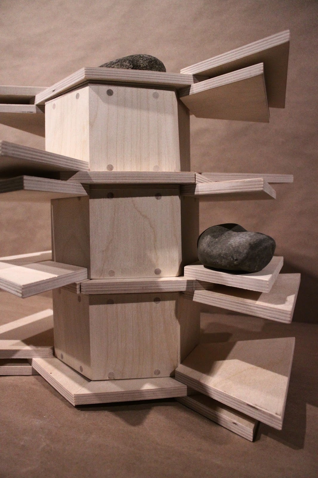
The final exploration was much broader. We were asked to give our object "life" again by capturing something about its growing process and its connotations. Throughout the process, I gradually came to appreciate (and respect to a point) the systematic growth of corn, which became my focus of the last project. I compared the cob to a modular shelving unit, which I designed to be customizable so it could grow several directions. I continued the hexagonal structure.
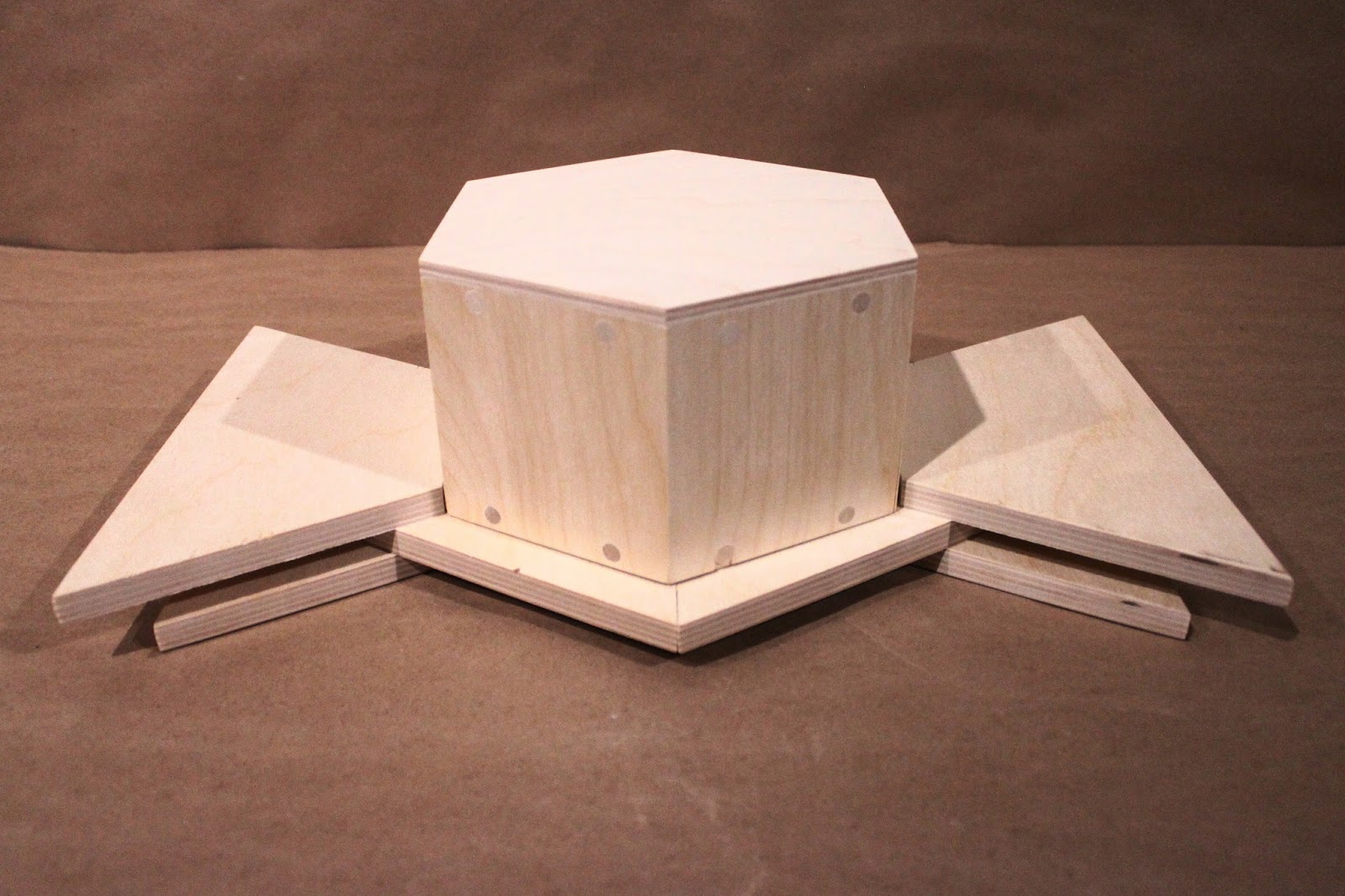
My completed set. With the time I had, I was able to make three shelves in total, which is the abridged version of the story I wanted to tell. The wood is baltic birch plywood, sanded to be smooth to the touch. There are circular details made of dowels in drilled holes on the faces of the hexagon.
A possible base for stacking.
When stacked, the trapezoids form shelves, whose length depends on which side is flipped up or down.
The most important lesson I learned while making this was the value of jigs to make uniform and consistent parts. I also learned about using a table saw to make mitered cuts for my hexagon core.
Service: Desine-Lab Poster
A group of students and faculty from RISD's architecture department run a group called Desine-Lab, which works with local groups around the globe on projects that are a mixture of social justice, entrepreneurial, and community building missions. Their recent project actually brought them closer to Providence-- a community development plan for next door city neighbor Central Falls. I became involved in creating a poster announcing their summer build academy, in which they had invited Colombian students to help out Central Falls' council. I collaborated with another first year RISD student, who drew the raw illustrations. I complied and altered them digitally to make several drafts.
These were my first two drafts. The top's color blocks are inspired by the Colombian flag (Central Falls is one of the largest concentrations of Colombian-born citizens living in the city, which is why Desine Lab invited Colombian students to help in city planning). The bottom draft is simply based on a summer-y theme with city skylines.
My collaborator and I however decided to take a route more personalized towards the city itself. She drew one street in the city and I created a small illustration for it. The flag colors make a return, although more muted.

We then played around with hierarchy of information and trying to find a balance between text and interesting designs. Ultimately, the Desine Lab team chose the poster on the left. This was our first dive into poster design, and I feel more and more comfortable with drafting digitally/quickly. I wasn't able to join in the efforts myself, but the team had a great summer and have gotten a lot of great work done!
Saturday, January 18, 2014
Thursday, January 16, 2014
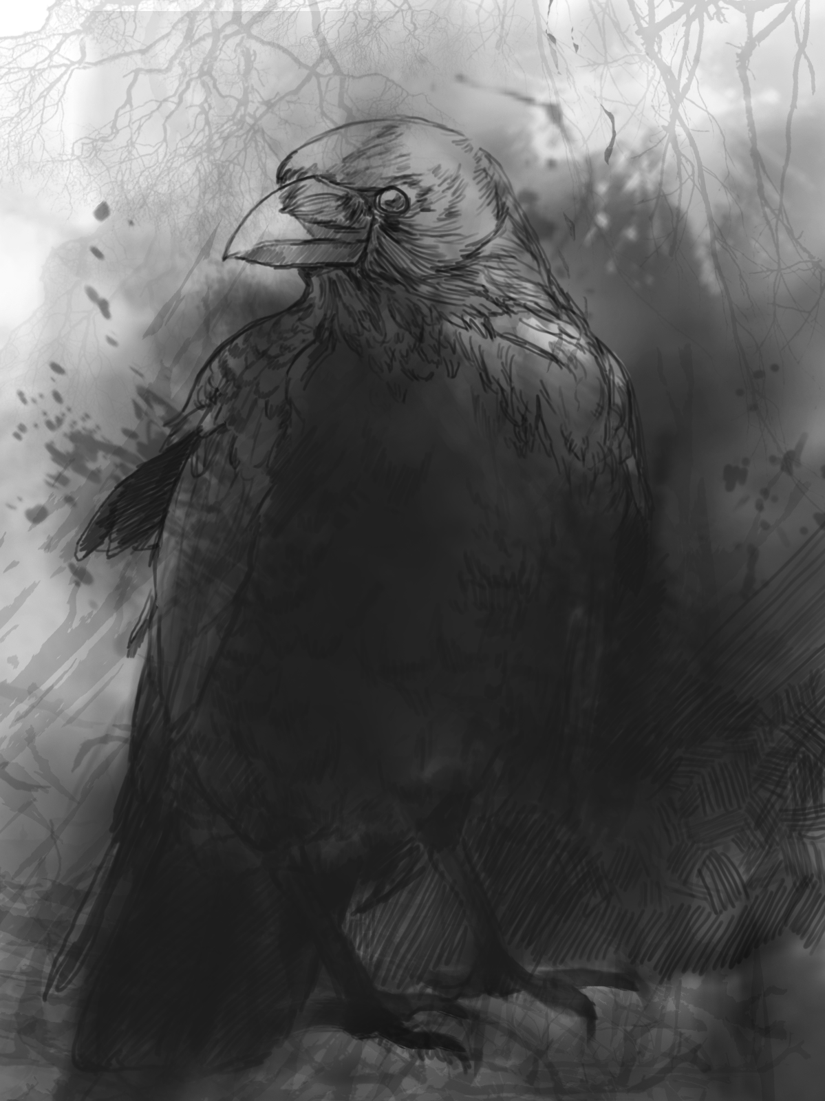
Doodles: Crow Brush Experiment
Decided to try combining some of the stencil ideas from drawing class with the multitude of photoshop brushes. I'm not completely satisfied with the value placements, but my goal was to explore the washed out ink marks.
Wednesday, January 15, 2014
Doodles: Prep
I'm trying to gain more consistency in style, so here's a quick sketch that I will expand more on later for a cleaner, cartoon type look.
Tuesday, January 14, 2014
Subscribe to:
Posts (Atom)