Friday, February 6, 2015

Theater: Stage dressing and Construction

Wintersession allowed me to be a part of many sets at the same time, which I got to see being used in action. Seeing pieces that I worked on being used and played with by actors was definitely a gratifying and informative experience.

This is Collected Stories, which took place in a writer's apartment. The Matisse painting on the far right is mentioned often in the play, referring to the writer's eclectic style and fondness for collecting worldly art pieces. My art history helped me greatly in "curating" her apartment. 


Seminar was held in the larger upstairs theater. I constructed the stage and seatings here, and also painted some parts here and there. This one was definitely fun to watch how actors moved in a a minimal space like this set.


Theater: Set Design Studio

In conjunction with my theater internship, I took a class taught by a Brown University theater professor. I found that this class gave me an outlet for more conceptual stage designs, in order to maximize playing area flexibility and focus on building audience-actor relationship. While 2nd Story Theatre had contemporary plays, my class worked on Hamlet and Richard III to explore the universality of Shakespearean themes.

My professor often encouraged sets that were urban-inspired with a modernized time setting. I looked into places I was familiar with and remember being intrigued by the different levels and maze-like quality in a subway station. Descending into the winding corridors underground evoked a stifling environment that I felt was continuously present in Hamlet.

The space is modeled after the Sandra Gamm theatre, another small local venue. 

My foam core model. A restriction for this set was to include 137 seats, which was a challenge. I looked into wide stair levels, grates, and platforms as potential acting areas and seating. I also included a small area I imagined to be a newstand, which would provide some furniture if necessary,

For Richard III, I went in the direction of docks, piers, and boardwalks, which used linear pathways and connecting ramps/stairs. 

This theater space was modeled after Trinity Reperatory's larger black box theater. My first pass before adding in slate rock-like cliff faces.

Some texture included. 

If I were to return to the drawing board, I would start the level planning entirely with rocks. I experimented breaking apart my set, and thought this direction would be just as intriguing.


Thursday, February 5, 2015

Theater: Stage Design for 4000 Miles

This Wintersession I had the great opportunity to work very closely with 2nd Story Theatre's technical director. The theatre is a local building with black box layouts both upstairs and downstairs, and I thoroughly enjoyed the space.

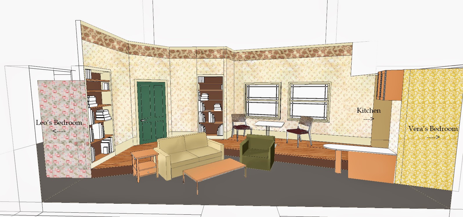
Wintersession being where it is, I worked on several plays in various stages (no pun intended) of completion. I found the most amount of design freedom and conceptual exploration through the 4000 Miles set, which is a contemporary play that takes place in a grandmother's apartment.


This is my quick Photoshop rendering I made on top of a Sketch Up model I made in order to draft a color scheme and room textures. Wallpaper became an important element to give a worn, outdated apartment look.

A near-planned view of the 4000 Miles set. I spent some time here to figure out what furniture could be used and gives flexible enough playing space.

A reference photo we used for the cramped, yet quaint and home-y atmosphere.
 
I visited the local stores to scout out for potential wallpapers. This one made it to the director's choice.

Friday, October 3, 2014

Doodles: Concept Drafting

I recently teamed up with some of my good Resident Adviser friends to develop an anti-vandalism campaign for our Residence Life office. We discussed and drafted several possible mascots, collectively named Bob the Bandaid. Here's a small preview of some Bobs below.


We are designing Bob to be the main hero of our awareness posters and will continue to flesh out the branding process of Project Bob with the rest of Res Life staff.


Thursday, October 2, 2014

Doodles: Digital Mindmap

As a simple exercise in Photoshop layering and masks, my Design Principles class asked us to create a mindmap of ourselves- essentially a self portrait of our perspectives as opposed to our appearances.


The central theme of my mind map is the "lovely melancholy" of wandering. The piece's base layer is an altered image of the Carina Nebula, which is then covered in text from The Little Prince, and my own photographs I have taken of Providence. Outer space, Antoine de Saint-Exupéry's novel, and my recent urban travels all tie into my fascination with exploration. I chose to obscure these images within to encourage a visual exploration of the piece as well. I incorporated my fondness of birds (as a grounding focal point) and hexagonal shapes (as a textural quality) as more direct images. As I continued working, my piece morphed into something more mysterious, which I played with to get this end result.

Wednesday, September 3, 2014

Resident Hallway Signs

 As a Resident Adviser, one of my duties is to keep my dorm floor a quiet and productive environment for everyone. I created some informational signs for my hallway as an easy guide to the school's resources. To fit my floor's spaceship theme, I used a futuristic computer interface aesthetic as implied hallway display screens.


Above is the poster I created as a 36"x 44" bulletin board. Below includes four smaller posters that list additional information.


Saturday, August 9, 2014

Theater: Stage


Our second summer production was Godspell, which performed outside on campus. I hadn't known about stagecraft beforehand so assembling staircases and dressing the set was a lot of hard work but great fun!


It's hard to see, but the center stage has two levels, so the band pit is in the center behind the performing area. The catwalk was the connect the stage to the AV equipment off to the far right. The towers are these amazing pieces of sound equipment.


I wasn't needed for additional deck duties in Godspell, but as props master I helped out more in the preliminary set up. You can see a bit of the lighting used in the show above.

Here are also some more set photos from Hello Dolly. Researching and pulling together (a stylized version) period setting was a great experience.


Top: Rich man Vandergelder's feed store. I dressed the shelves behind the counter.
Middle: The trick cake and pheasants in action!
Bottom: A New York hat shop. I helped put together the table set up.